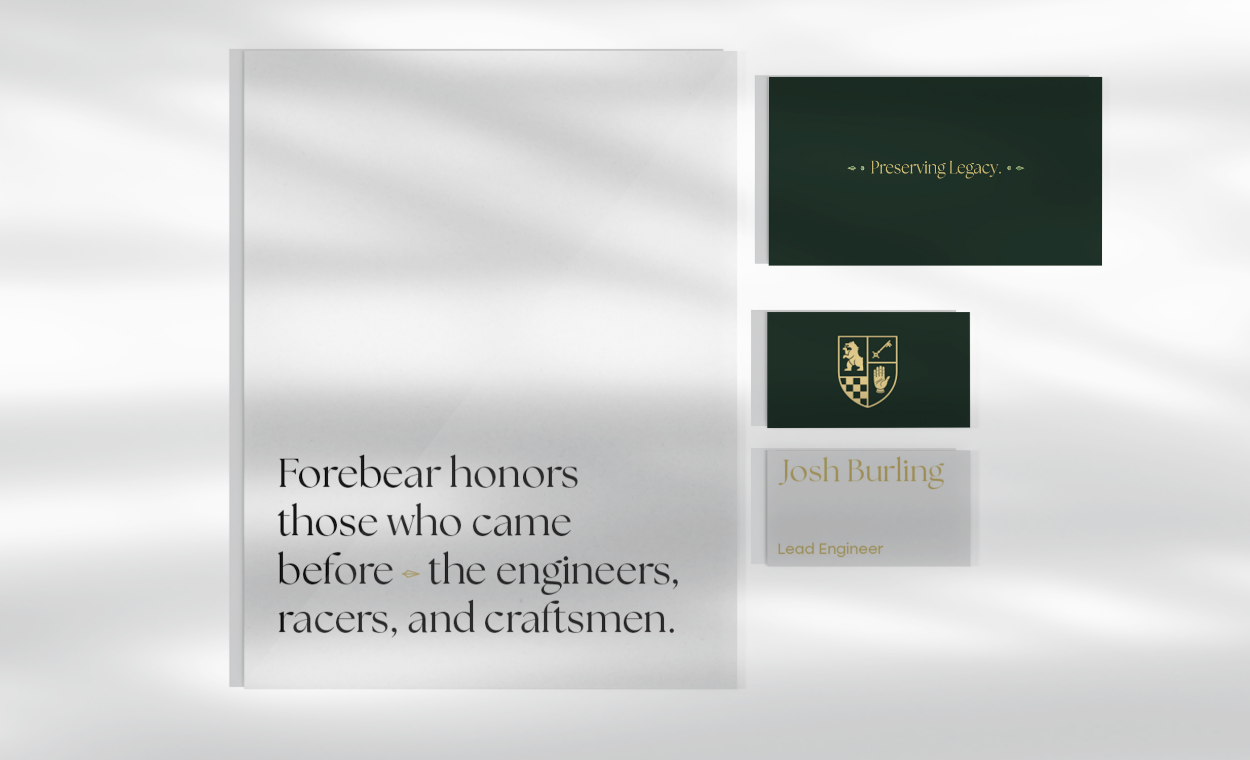
As a hyper-specialised mechanic in the restoration of historic British racing cars, Josh Burling decided it was time to take his talents to new heights, and needed a brand and visual identity to match his passion. As one of the leading experts in the industry, his roots ran deep, and he wanted a name and brand that captured his family's legacy and left a mark that would stand the test of time.
It's the craftsmanship and attention to detail poured into every project that sets Josh apart, a labour of passion that keeps him a cut above the rest, with a reputation not just for being trusted, but for fixing what many others can't. The logo needed to act as a signature of excellence, representing high-quality engineering artistry that creates winners, while enriching and preserving British automotive heritage and carrying that legacy forward.
The target client needs more than technical skill; they need an emotional understanding of what their vehicle means to them, and total confidence that the workshop knows their car better than they do. They're not just buying a service; they're outsourcing their worry.
After our in-person workshop, we set to work understanding landscape & clientele to define Josh’s positioning as a high-end passion driven brand. We carried out rounds of name ideation & due diligence to find a name that communicated his story and craftsmanship. Culminating in the creation of a deeply personal brand identity exuding with symbolism & memorable signature that could be applied to every build.
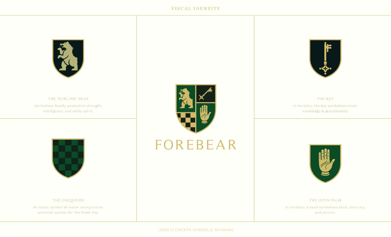
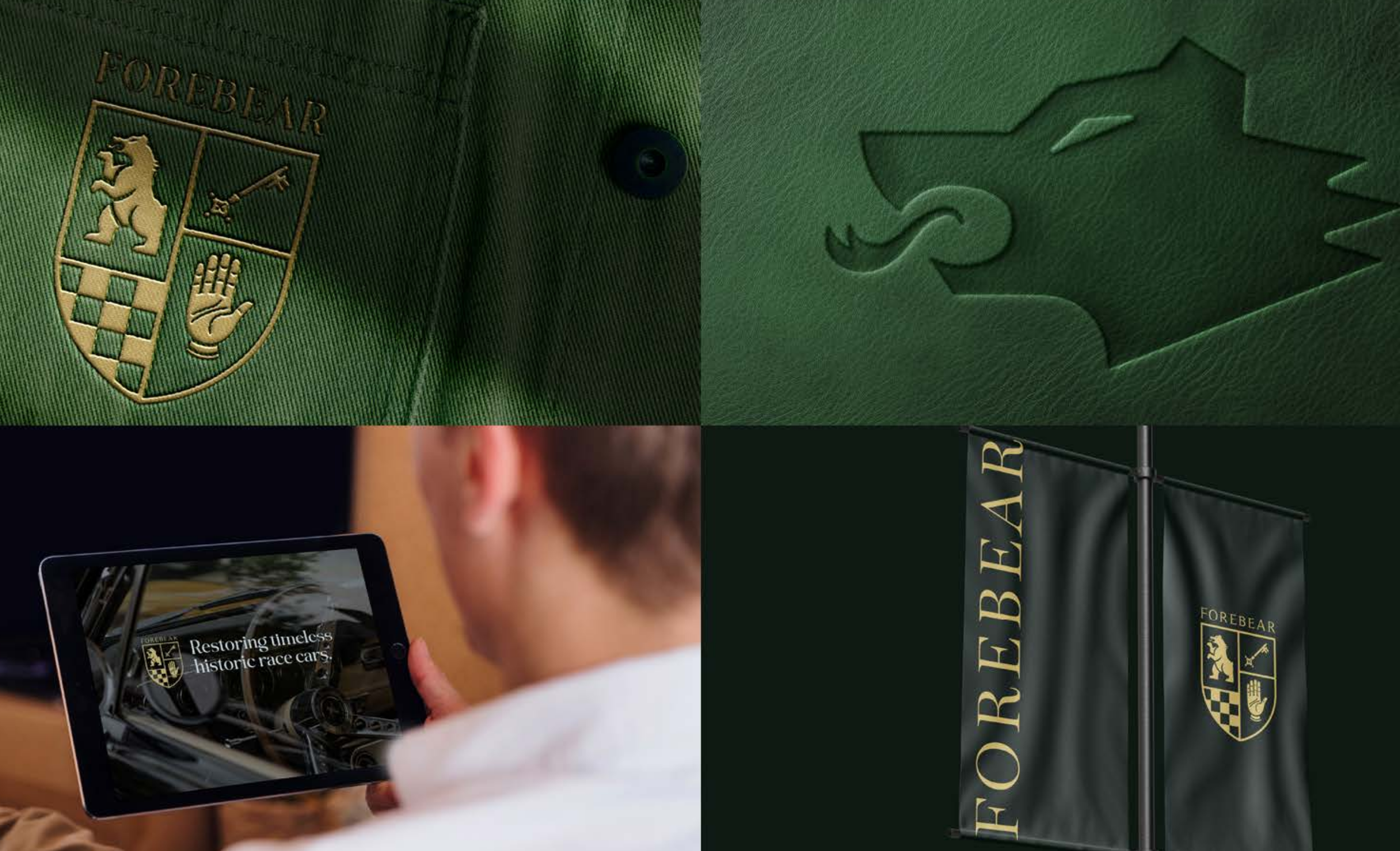
Standards that Exceed Expectation was a cornerstone theme entwined with a steep talent and heritage. We knew this needed to come out in the creative direction. The name Forebear stems from the proud family heritage. We created a logo and a visual language that established the primary values, we did this by developing a coat of arms logo. The ‘Burling Bear’ symbolises family, protective strength, intelligence, and noble spirit. The Keys In heraldry, symbolises trust, knowledge & guardianship. The Chequers is an iconic symbol of motor racing and an universal symbol for the finish line. Finally The Open Palm In heraldry, a hand symbolises faith, sincerity, and service.
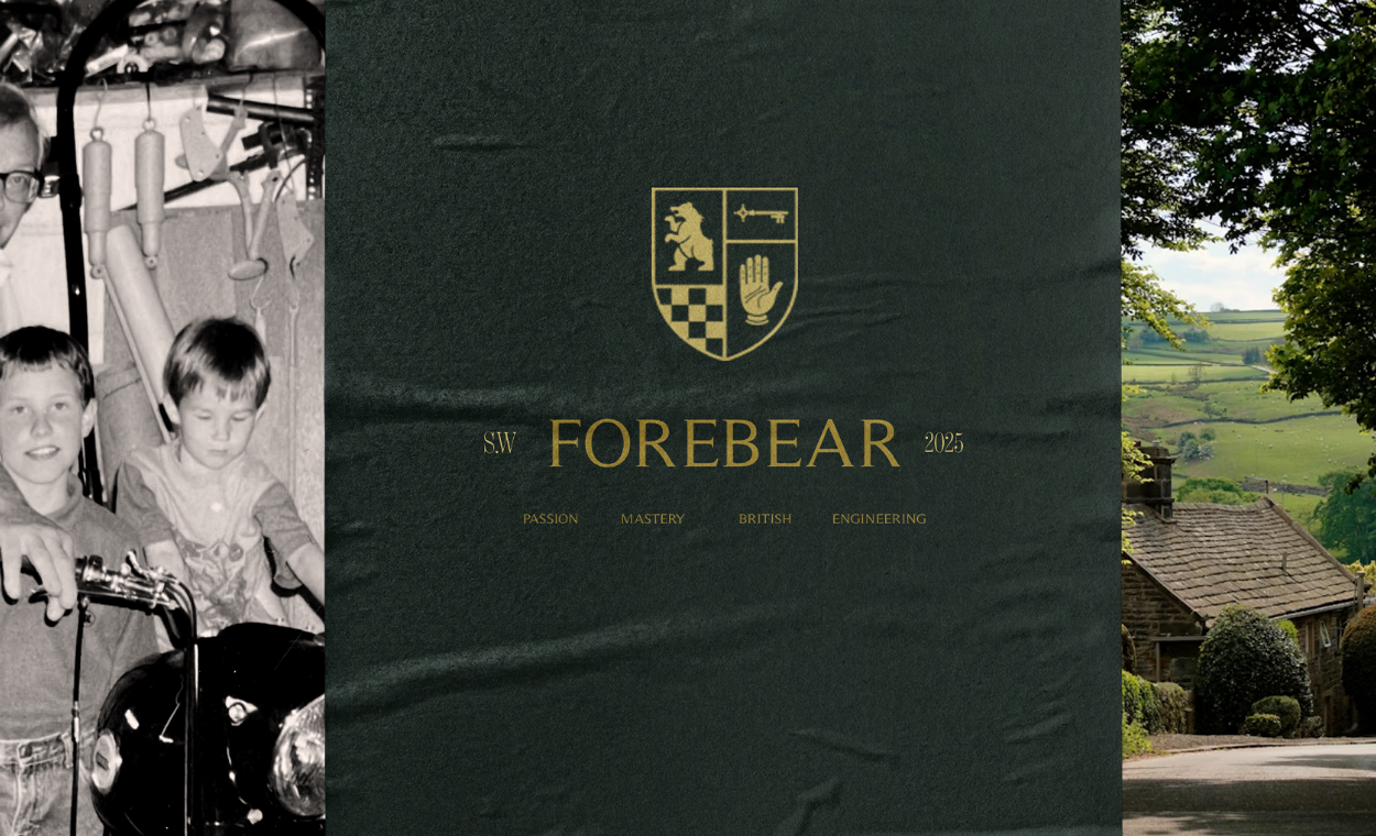
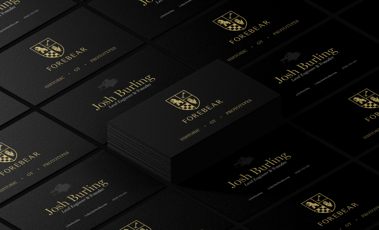
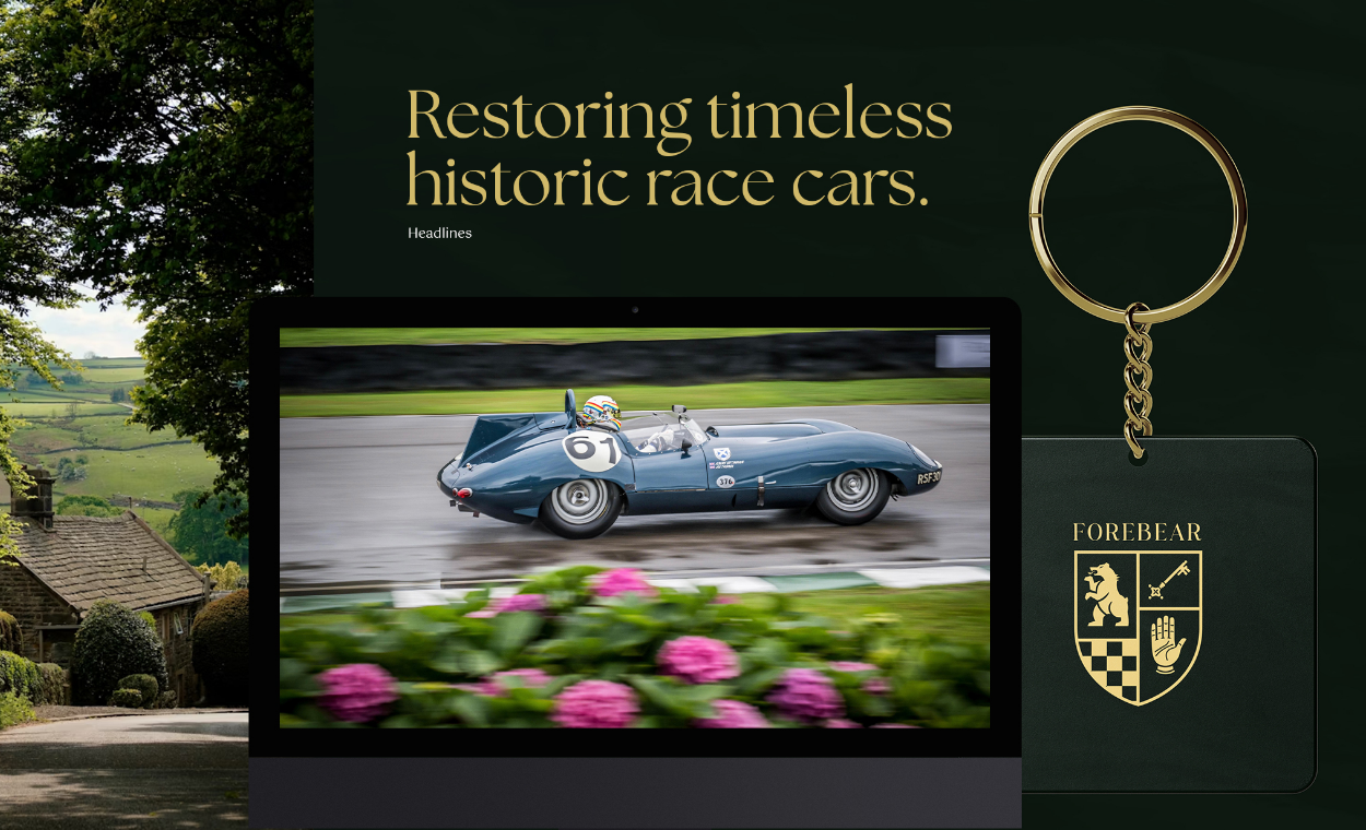
We worked with Josh every step of the way, travelling to his workshop and immersed our team into his world. A world of craftsmen with an in-depth expertise and knowledge backed by a traditional approach that makes him unique. After we found a name, we developed the brand identity tailored to his bespoke audience. Delivering a final brand assets and comprehensive guidelines.